


Last week we looked at WAR (Wins Above Replacement) by franchise, where we were able to understand and visualize a bit of how we view the best players (by WAR) for each franchise/team for the 1901-2024 period. This time we’ll turn our attention to WAR distributions by decade and position in an effort to understand changes to the game over time.
One of the traditional ways to do this is by using a box plot where we can see a maximum value, an interquartile range (25th to 75th percentile) and a median value (the mid-point of the data). An even better solution is to merge a box plot with a violin plot, with the violin plot helping to show the shape of a distribution. Here’s an illustration using the decade of the 1900s (defined by when a player began their MLB career), generated with Flourish:
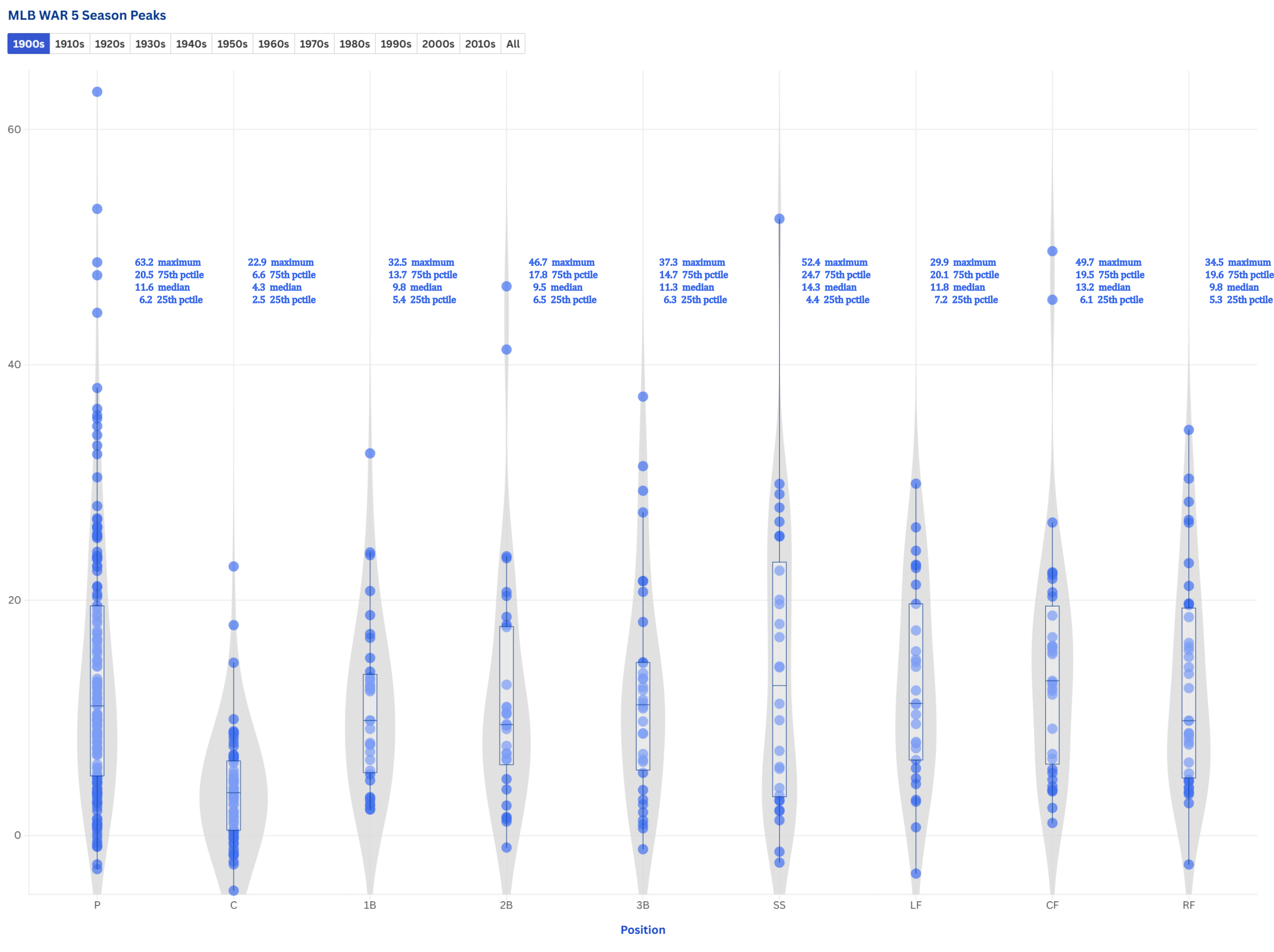
I’ve added annotations (in Inkscape) for each position so we can better understand the data patterns shown in the chart. A little bit about the chart components:
Violin plots are the curvy gray areas, one for each position
Box plots are represented as the narrow rectangles, one for each position, residing inside the violins
Individual circles correspond to individual players and their maximum 5-year WAR value
Annotation overlays tells us the max, 75th percentile, median, and 25th percentile values for each position shown in the chart
The violin plots help to define the general shape of the underlying data - note for example, the very different shapes of the P (pitcher) and C (catcher) distributions. There is just a single data point > 20 WAR for the catcher position, with most concentrated below 10 WAR, leading to a very low, rounded violin plot. In contrast, the pitcher violin plot is much taller and thinner, with many values > 20 WAR. In fact, the two highest values on the chart are both pitchers, while the highest performing catcher is lower than more than 25 players across other positions.
This information tells us that there likely weren’t any real standout catchers for this period, while there are numerous pitchers who would have been difficult to replace, based on their very high WAR values.
Now that I’ve developed the template shown above, I can move on to do the remaining decades through the 2010s (the 2020s don’t have enough data points yet). I suspect we’ll see changes across time that reflect changes to the game as it evolved - the end of the deadball era, the influence of Babe Ruth, the rise of offense in the 1930s, the integration of the game in the late 1940s, the increasing influence of Latin players in the 1960s and beyond, the dominance of pitching in the 1960s, and the advent of steroids and other substances in the 1990s.
It promises to be an interesting journey, one that will form a chapter in my upcoming book, targeted for Fall 2025. I hope you can join me along the way as I attempt to put a visual lens on the great game of baseball.